Colors
Colors do not mean the same thing around the world.
Example: Stock markets
A classic example of this is how share prices are visualized at stock markets.
In western markets like the United States, prices that are increasing are green, and prices that are decreasing are red.
In some countries like China, Japan, and Korea, it is the opposite. In these locales, red is considered fortune/joy/lucky, so prices that are increasing are shown in red.
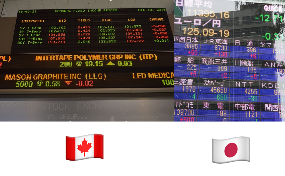
Images licensed under CC-BY-SA-4.0 Open Grid Scheduler / Grid Engine (from Wikimedia Commons), CC-BY-2.0 Dick Thomas Johnson (from Wikimedia Commons)
.jpg)
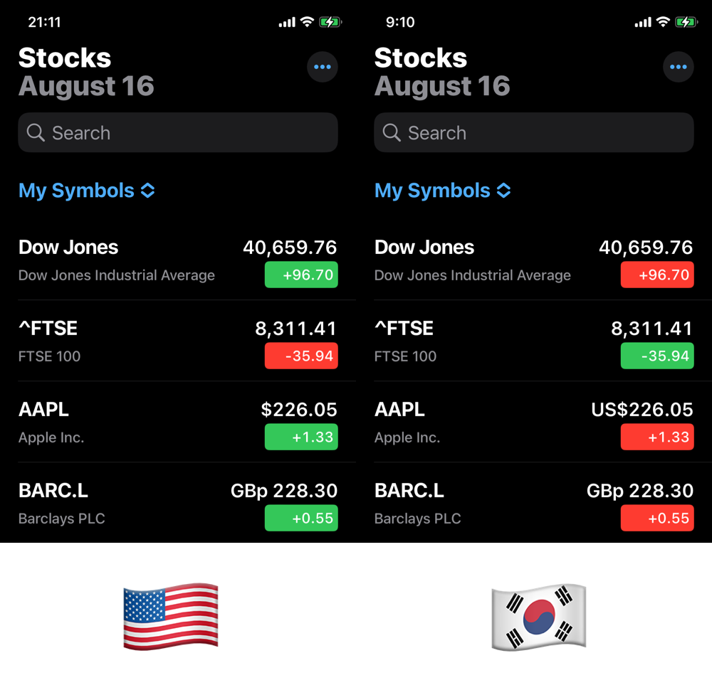
On iOS, Apple replicates this custom in the Stocks app when you change the Region settings.
Example: Calendar app icon
Another example of colors changing depending on region is Apple's Calendar app. In the United States the day of the week is shown in red. But in countries like Japan and South Korea the day of the week is shown in black.
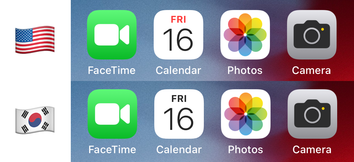
There's this Apple Community thread and another MacRumors thread discussing this feature, and it confuses many people because it's not obvious that changing the region would visually affect the apps this way.
It's not clear to me why Apple did this. The only investigation into this that I can find is a post written by Frieda Handoko in 2016. My theory is the same as the author's, to improve legibility for complicated glyphs like those featured in logographic writing systems. Perhaps it's just accidental that the color is tied with the region, rather than the language selected.
Example: International standards for safety signs
ISO 3864 is the international standard for safety signs. The wikipedia page shows a list of colors and their respective meaning. In summary:
- Yellow is Warning
- Red is Prohibition/Fire Equipment
- Blue is Mandatory
- Green is Safe Condition

I haven't confirmed how many countries have actually adopted this standard. Curiously, Japan created their own system with slightly tweaked colors, which you can see on the Japanese Wikipedia page.
User interface design
Color in used a lot in UI design. For example, a destructive action such as deleting an item or logging out is often highlighted with a red accent. The button or the text itself might be red.
Most UI frameworks will use:
- ✅ Green for success
- ⚠️ Yellow for warning
- 🛑 Red for danger
Following the stock market example, one might think that eastern cultures might swap the red color with something else to represent danger, but this does not appear to be the case. Switching regions on iOS never changed the color of text for destructive actions to another color. But it's also possible that western culture has erased other culture's existing expectations.
Additional resources
- Information is Beautiful created a nice visualization of how colors are used across different cultures. The number 35 for "Good Luck" confirms the stock market example.
- Juxtopposed made a YouTube video on color, including a short note on color psychology and how context is important.